
Unmasking face mask use: is there a difference between what people self-report and what they actually do?

Real-time imagery can help understand how behaviour on the streets impacts the spread of COVID-19
We’ve all heard the debates about wearing face masks during the Coronavirus pandemic. We’d like to ask a different question: whether people behave as they self-report when it comes to face mask wearing and whether people’s behaviour in the most public place of all — the street — can be tied to how COVID-19 unraveled?
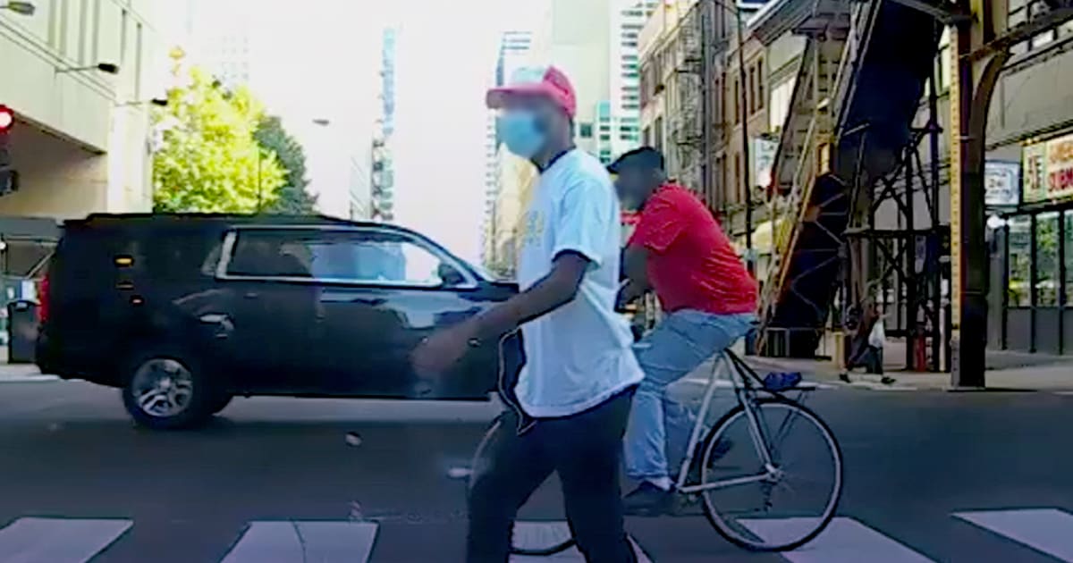
Using our crowd-sourced vision data (obtained from dash cams while preserving users’ privacy), Nexar took a deeper dive into just how many people in select metro areas are wearing face masks versus what they self-report. Additionally, Cornell researchers used our data as part of a holistic analysis of New York and how the disease spread there.
Mask wearing
This in-depth research took us to the streets of several U.S. metropolitan areas — including Atlanta, Chicago, Houston — to investigate the usage of face masks in various parts of each city.
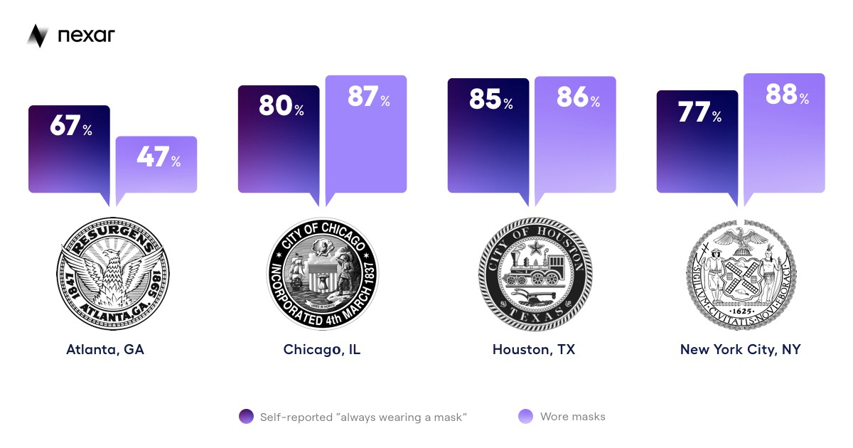
In July, The New York Times published “A Detailed Map of Who is Wearing Masks in the US”. The data came from 250,000 responses from interviews conducted in early July 2020. The report notes regional variations, even within metropolitan areas, and an overall mask usage rate of 59% in the US.
The goal of the project was to compare the New York Times data (which was basically self-reporting) with imagery-based data from Nexar’s network. Initially we were wondering whether there is a case of Survey Bias — the tendency of people to answer survey questions untruthfully or misleadingly, according to their perception of whether their answers are socially acceptable.
In the following graphic, we can see how the number of people who self-reported to the New York Times that they wear face masks compares to what our data and research showed for the period of July 1–23, 2020. A quick look at the results shows that our data was nearly directly in line with the New York Times data for each city, with some interesting variations in Chicago and Houston, where Nexar actually detected more people wearing masks than what was self-reported (perhaps as a result of Nexar naturally focusing on more trafficked areas of the city or changes during the month of July). Similarly, in NYC the data included mostly people around bus stations, where people tend more to wear masks as a result of crowding while they wait for the bus.
Cornell’s New York City Research
Cornell recently used Nexar data (and other sources) in order to Track Urban Mobility and Occupancy under Social Distancing Policy. In this research, outdoor pedestrian activity in New York City was researched, in order to develop tools for urban planners and policy makers to better understand and track compliance with public health mandates such as mask wearing.
Cornell decided to go beyond self-reported surveys or direct counts (which, by their very nature, occur on a small scale). Cornell researchers believe developing computer vision methods for this task can outperform existing measures. Cornell used all sorts of data, from video streams gathered from public traffic cameras to Nexar’s data. Commenting on the use of Nexar data, Cornell researchers said “Access to their data allows us to view large swaths of street-level imagery that would otherwise be impossible to collect. Their network is sufficiently large that we can even examine the same location multiple times a day across days. Nexar broadens the scale of data capture beyond where we could collect data ourselves and enables analysis of neighbourhoods not covered by traffic cameras”.
Several interesting findings were discovered along the way. For example, while we know that most viral transmission of Corona occurs indoors, in Far Rockaway, Queens, sidewalk widths were found to be disproportionately small compared to other parts of the city — making social distancing more difficult. This may be one of the causes of Far Rockaway being one of the New York City neighbourhoods having some of the highest rates of coronavirus deaths in the city.
New York’s vast public infrastructure of cameras was also utilized in the study, by scraping images from the feeds of almost 650 publicly accessible traffic cameras. These cameras operate 24 hours a day, with fixed longitudinal data that allows for comparing street-view imagery with a consistent baseline for social mobility. Because the built environment is standardized, features such as crosswalk measurements above as fiducials can be enabled to measure distances that would otherwise be difficult in single camera systems.